I was fortunate at Stitches West to be able to take the “Color in Fair Isle: from Inspiration to Motif” class taught by Janine Bajus, whose book, The Joy of Color, I bought a few years ago and have admired ever since. It hasn’t gone beyond admiration because too much to make, so little time (isn’t that always the way?).
Homework was to bring (an) inspiration source(s). My self-assigned homework was a gauge swatch with Shetland wool. I worked this with Jamieson & Smith 2-Ply Jumper Weight 2 weeks before SW:

Well, I guess I come out as a loose knitter with this Shetland yarn. For the lower part I used 3.0 mm needles and for the top part 2.5 mm. The 2.5 gives me a nicer fabric and, bonus!, the stitch gauge I need to knit the Bougainvillea Vest kit I bought at SW 3 years ago (although nowhere near the row gauge, harumph, and that pattern suggests 3.25 mm). On to class!
On day 1, you chose an inspiration and used the Ultimate 3-in-1 Color Tool by Joen Wolfrom to select a few likely color families. My source is a photo I took of a painting by artist Eyvind Earle that hung at the Disney Family Museum. I ended up using page 4 for spring greens, which range from pale to bright to very dark, and page 21 for oranges as my main color families. The greens in the painting really lean spring and not green greens; my eye sees blue greens in the photo but the Color Tool disagrees. Janine explained that brown doesn’t have its own page because brown is always a blend of other colors, and she was right. I found the brown yarns in class belonged to their color family pages.
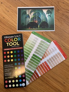
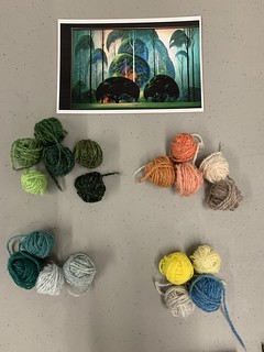
You then set the photo aside and went to the big yarn playpen containing 200+ colors of Jamieson’s Spindrift with only the Color Tool in hand to gather together colors from the pages you chose. The tool obviously does not have every possible shade of every color family, but holding the tool above the pile of yarns, yarns just jumped into my field of vision. It was so automatic and a little eerie. Choosing yarns took longer than I thought it would, up to the lunch break and a bit of time afterward. The goal was to end up with about 20 colors. Here are my choices next to the source photo.
In the afternoon of day 1, we cast on for our speed swatches, the striped bit in the photo below. This swatch is to ensure your chosen colors have enough contrast to give you strongly visible diagonal lines between the groups. My diagonal lines worked out well and I was happy with all but the beige. Others in the class had to do more revising and longer swatches and that is OK.
Day 2 began with some more work on speed swatches and then launching into motif swatches. Decision: which group of colors to use as background and which as pattern? I settled on orange as background and green as pattern. Further decision: which pop color(s) to use? I agreed with Janine in her critique that the bright yellow I chose interrupts the eye from seeing the motif’s pattern against background. She suggested I swap the position of the pop color in that row — use the yellow as background instead of as pattern color — so I worked the second motif that way without ripping so I could compare them.

It is still not quite right to my eye although I really like it from a distance. I over-embroidered 4 or 5 other colors on both rows during class to see what might work and none really did. Earle used that blue I pulled and it didn’t look right in the swatch. I am not worried; there are lots of shades of yellow and other colors to try, plus I can try a different motif or two because it might just be this motif that doesn’t work. I also want to add the beige (actually an orange) from the speed swatch back in for motif swatching because in sunlight instead of classroom fluorescents, it reads differently.
I deliberately chose an inspiration in colors I do not normally work with, hoping that breaking from the usual would prevent my eyes from drifting to the shades I like best rather than allowing the class curriculum to do its job. I think I succeeded — I like my swatch.
It is not much knitting to show for 12 hours of class, and gads, was I tired. Two-day classes always do me in.
It’s hard to quantify what all I learned. Janine is a knowledgeable, kind, and well-practiced colorwork teacher so if this topic interests you, I recommend her highly. I gained a lot of confidence with that Color Tool booklet and wander the apartment holding it up to various objects, watching the color families jump out at me when I find the right page. I used it to identify the Annapurna I bought from AVFKW in “mollusk” as a purple (I saw it as a pretty but unclassifiable brown). I always thought I was hopeless at this — Mr. MmmYarn was good at color pairing — and it turns out I only needed some instruction. After seeing the yarn playpen, I have an urge to buy all 200+ colors of Spindrift and must resist, although I think I will eventually buy the 12 colors I used and see where the yarn takes me. Of course, the 14 skeins of Spindrift I already have in the bins are not in these colors. Fortunately, I have plenty of other things to knit in the meantime.


Leave a comment
Comments feed for this article